learn more about Twin Ribbons here!


© 100architects
Kids 3rd Home
Super Brand Mall | Lujiazui | Shanghai | China
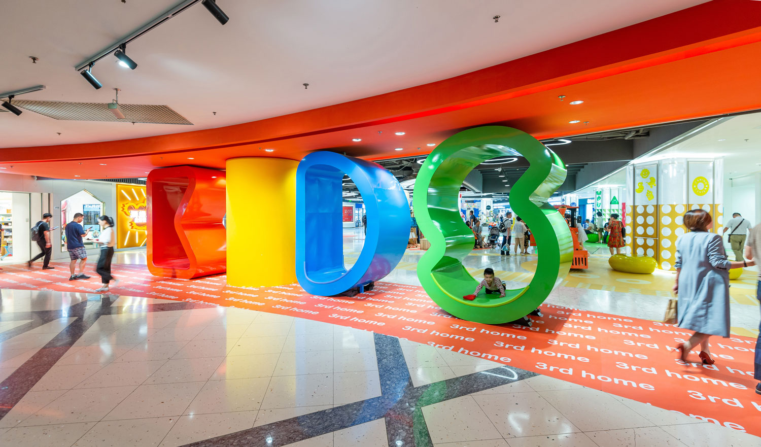
Kids 3rd Home is an interior renovation designed to beautify a scarcely used space within the iconic “Super Brand Mall” of Lujiazui in Pudong (Shanghai), oriented to foster entertainment & social interactions among kids and families in the 2nd floor of the Mall.
Super Brand Mall is one of the most iconic and well-known commercial spaces in Shanghai and China, with almost 20 years of existence, and it’s in a process of renovation to keep up to date.
100 Architects was commissioned with the mission of intervening a wide and large circulation area of 1,800 m2 in between tenants oriented to kids & families.
In order to turn it into a vibrant and eye-catching space to stay and interact with other customers, which would offer an entertaining experience linked to the normal course of the commercial activity.
The entire proposal derives from the position of the 9 columns that invade the big space, which become 9 epicenters of different colors and activities.
Born from those 9 columns, a colorful painted scape on the floor was designed by stripes of colors and shapes, organizing the rest of the empty space, defining circulation areas, resting spaces, playing areas and spaces for pop-up stores.
The injection of basic vivid colors, patterns and shapes allowed us to visually enhance the space, making it more appealing to visitors and customers, deviating more pedestrian circulation towards the given area.
The 9 columns are retro-illuminated enhancing their presence as landmark elements within the space.
The ceiling, which is treated as an exposed ceiling, is also retro-illuminated only over the columns, featuring special illuminated spaces together with the columns.
The rest of the exposed ceiling features a system of custom-made lightboxes with basic fun shapes related to the design language from the rest of the space.
A simple yet effective beautification exercise crowned with huge habitable letters forming the word KIDS on both ends of the circulation space. The huge letters act as eye-catching attractors since they are visible from far and different floors, becoming entrance landmarks to the new space.
CREDITS:
Project Name: Kids 3rd Home
Design: 100architects (Shanghai)
Design Team: Marcial Jesús, Javier González, Marta Pinheiro, Lara Broglio, Mónica Páez, Keith Gong.
Client: Super Brand Mall.
Area: 1800 m2
Completion: July 2019
Location: 168 Lujiazui W Rd, Lujiazui, Pudong, Shanghai, China
Photography: Amey Kandalgaonkar
About
The injection of basic vivid colors, patterns and shapes allowed us to visually enhance the space, making it more appealing to visitors and customers, deviating more pedestrian circulation towards the given area.
More images
What is an interior intervention?
It is the type of intervention that is carried out in an interior space, related to the alteration of the interior of buildings and their internal spatial configurations, through the insertion or installation of new elements aligned within an existing interior environment.
This typology requires a careful adaptation to the context, the form and the structure of the hosting space. It is a surgical or parasitic intervention that renews the attributes of the space, completely changing the way it is perceived and used by its users.
Usually, this tactical intervention is based on the colonization of the existing surfaces of the space, without altering the three-dimensional configuration of the building. By cladding or covering existing surfaces or even inserting foreign objects, placed on top of existing surfaces, we can add aesthetic and programmatic features that can improve the functionality of the interior space.
Projects
insta100
Publications

Wired Scape, designed by 100architects, is a groundbreaking playscape in Guangzhou, China, blending natural landscapes with dynamic, fluid forms. This innovative public space offers a unique play experience for all ages, combining nature, design, and adventure into one captivating destination.

It is an explosion of colors, where vibrant hues blend seamlessly to form four distinct rectangular stripes, each representing a unique activity zone. These stripes create a dynamic flow, inviting users to engage with the space in different ways. The interplay of colors and design transforms the area into an interactive and playful environment.